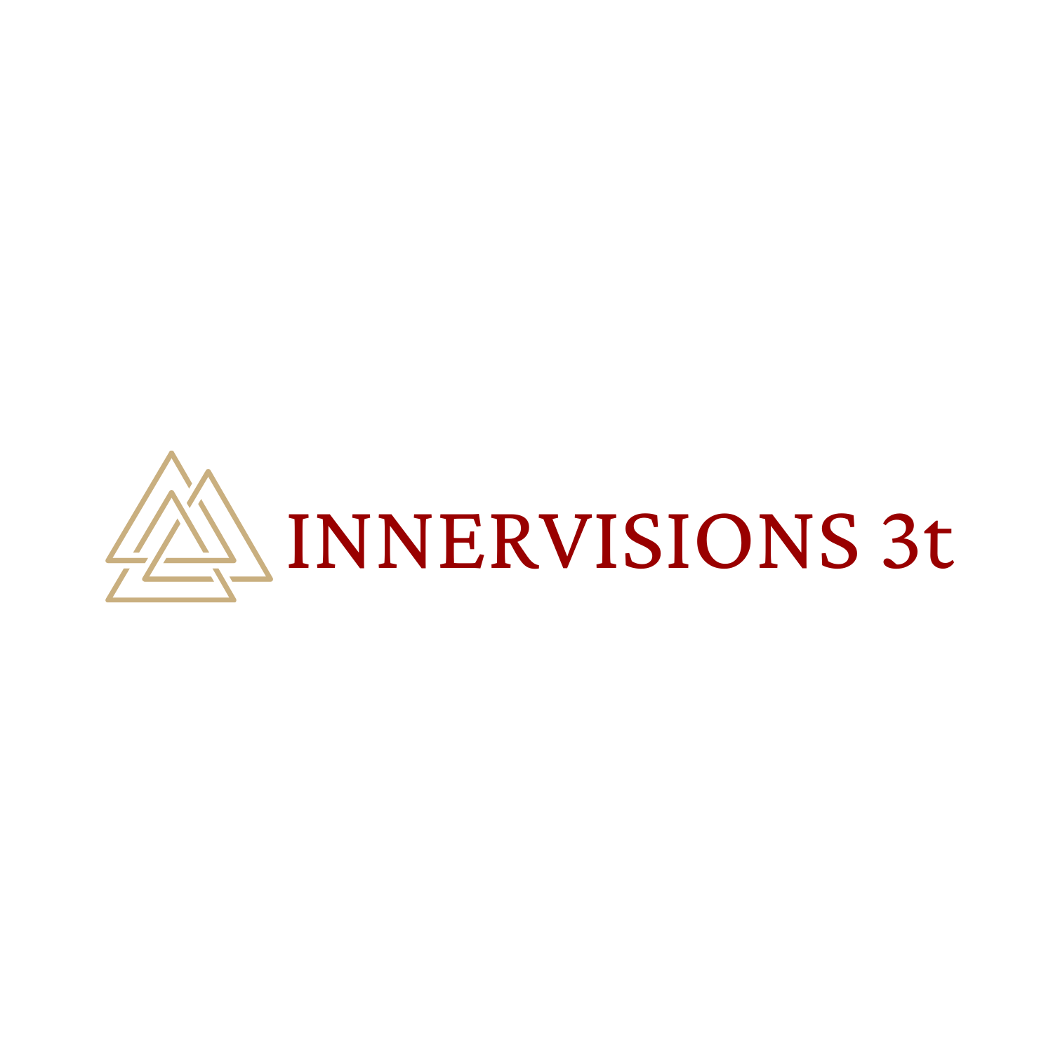
InnerVisions 3t
Logo Concept 1
The font used is called Crimson Pro. It is a contemporary, clear, and classical font that communicates tradition and welcomeness. I felt this was a powerful font that will be relevant for years and years.
The icon/symbol used is three triangles intertwined together. To me, this communicates the trinity. The Father, the Son, and the Holy Spirit — working together and connecting people. It tells me that InnerVisions’ foundation is in Christ, and that with HIM, this life-changing club is possible. You guys seek the Lord, then work together to accomplish big things.
The colors used are crimson red, to communicate the blood of Jesus. As well as gold to communicate value.


Logo Concept 2
The letter font used is called Poppins. It is a modern, new, yet very traditional font that peace and friendliness. The “3” font is called Intro Pro. I chose this because it represents more than just a number — it represents the trinity. It is a number, and a geometrical shape.
I used two icons/symbol in this design piece. The first one is the “V” — To me, it makes the name stand out. It also looks like someone reaching their hands up to the sky, praising the Lord. I did two “v” shapes to convey growth and that this is a team effort — no one left alone. The other symbol is a cross. That one explains itself :)
The colors used are crimson red, to communicate the blood of Jesus. As well as gold to communicate value.


Logo Concept 3
The font used is called Breul Grotesk. JUST A WARNING — THIS FONT REQUIRES A SPECIAL LICENSE. This font is a classical and straightforward font that communicates direction, as well as friendliness. It is bold without being stern. It communicates diversity.
The icon/symbol I used is a dotted arrow with a line to the right of it. To me, each dot represents a different child who is needing direction. It points to InnerVisions 3t, because that’s who is going to help them find it. There’s a line that they have to cross (joining the club) in order to find that direction and mentorship they deserve. It also communicates unity.
The colors used are crimson red, to communicate the blood of Jesus. As well as gold to communicate value.


